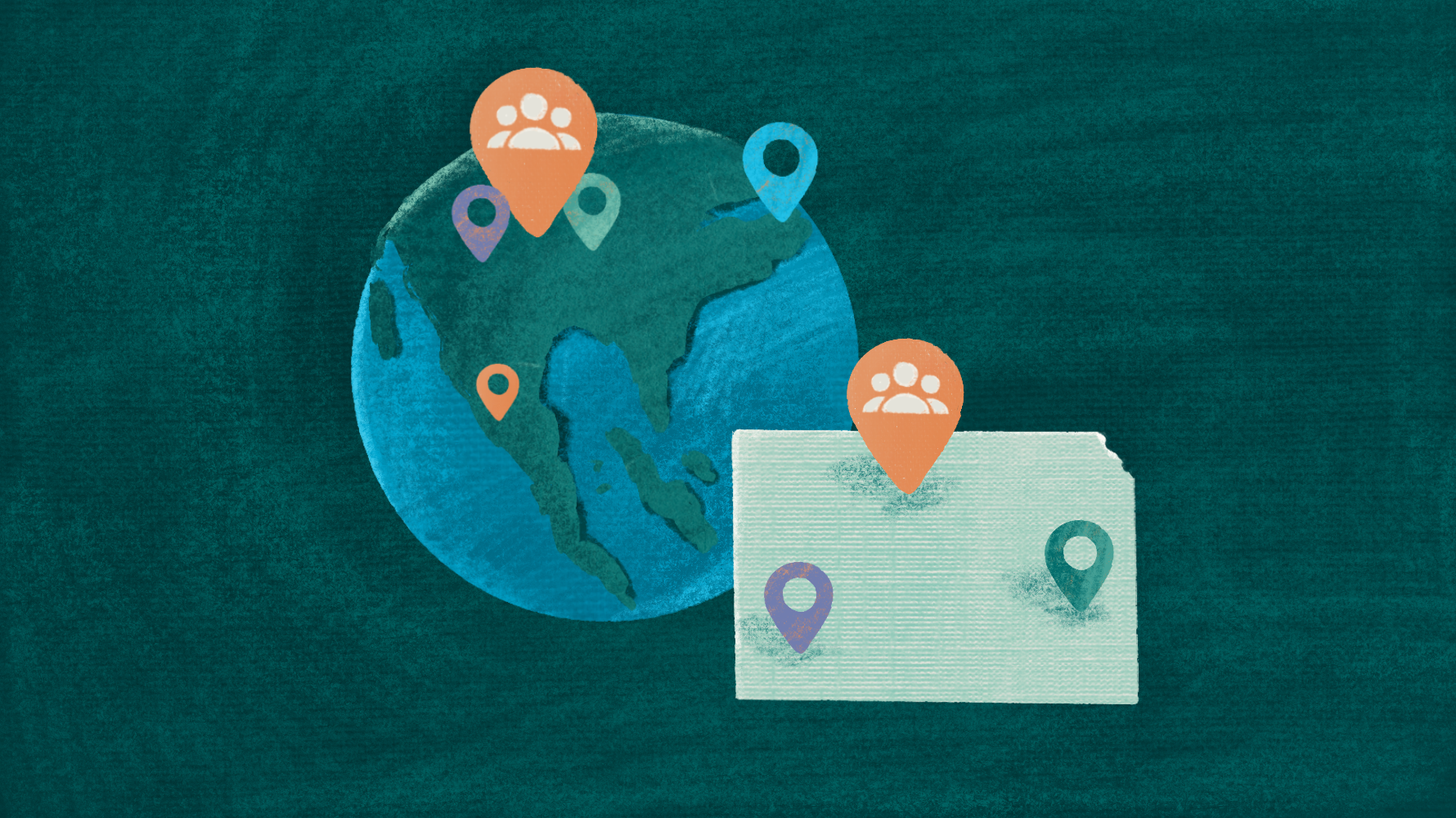

A client of mine wanted a map of their work. They had mobilized groups of volunteers across Kansas to make progress on an important issue and now wanted to see where the work was happening.
Here’s how our conversation went:
I asked, “What do you want to map? The people? The groups? The work they do?”
“Let’s do the groups.”
“Do the groups have an address? Or an organization they are connected to?”
“Well, not really, it’s just a grassroots collection of people.”
“Does everyone from each group live in the same city or county?”
“No. They can be from all over.”
“Does the work happen in a specific city or county?”
“Sometimes it happens in a county, but it could be multiple counties or half of the state. Some of the groups are focused on specific neighborhoods. It just depends.”
As you may have guessed, I couldn’t build a map.
Why is this so hard? All the work is happening in Kansas, so why can’t they “see” it on a map?
It’s because maps are not as simple as they seem.
Maps are like ogres
They have layers. And since humans drew the lines, it often doesn’t make sense.
In a perfect world filled with rational people, here’s what you would expect:
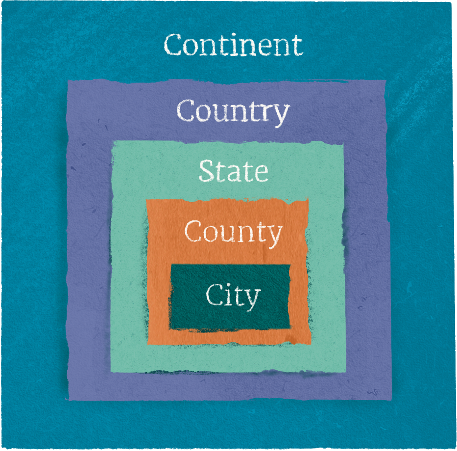
- Continents are divided into countries
- Countries are divided into states (sometimes called regions or provinces)
- States are divided into counties
- Counties are divided into cities
- Cities are divided into zip codes
But this is not the case. Sometimes, countries span continents.
Denmark is in Europe, but Greenland, an autonomous region of Denmark, is a part of the North American continent. (Some North Americans are trying to change this.)
Countries throughout history have often spanned continents (colonialism), and many territories today belong to countries on different continents.
Okay, countries may belong to different continents, but you would expect that states or territories can only belong to a single country.
But not Kashmir.
One of the most politically sensitive areas in the world, Kashmir appears on the national maps of Pakistan, India, and China. If you are wondering how a tech company like Google wades into issues like this, they adjust the lines on the map based on the user’s location. It’s also how they handle name changes like the “Gulf of America.”
Mercifully, every county in the United States belongs to a single state. But cities go wherever they want, crossing county and state lines. The city of Bristol, the birthplace of country music, is shared between Tennesee and Virginia. A city so special that it belongs to two counties and two states.
But what about zip codes? Surely, those are neatly organized? Created by the United States Postal Service in the 1960s to make mail delivery more efficient, zip codes can be as large as 13,700 square miles, like 99557 in Alaska, or as small as a single building, like 10104, which serves the Warner Center in Manhattan. While each zip code belongs to a single state, they ignore city and county boundaries.
Longitude and latitude are the purest forms of mapping (and my personal favorite) because they completely ignore the boundaries created by people. Astronomers for the win!
So what can we do?
Maps are complicated, but there are a few ways to keep things simple.
Get specific about the level of detail
Are you plotting little free libraries on a map? Use longitude and latitude. (Geocodio is great for that.)
Are you trying to show grant funding to rural communities? Use counties.
Do you want to compare the population you serve to an area’s socioeconomic indicators? Use zip codes.
Are you plotting points on a map or shading areas?
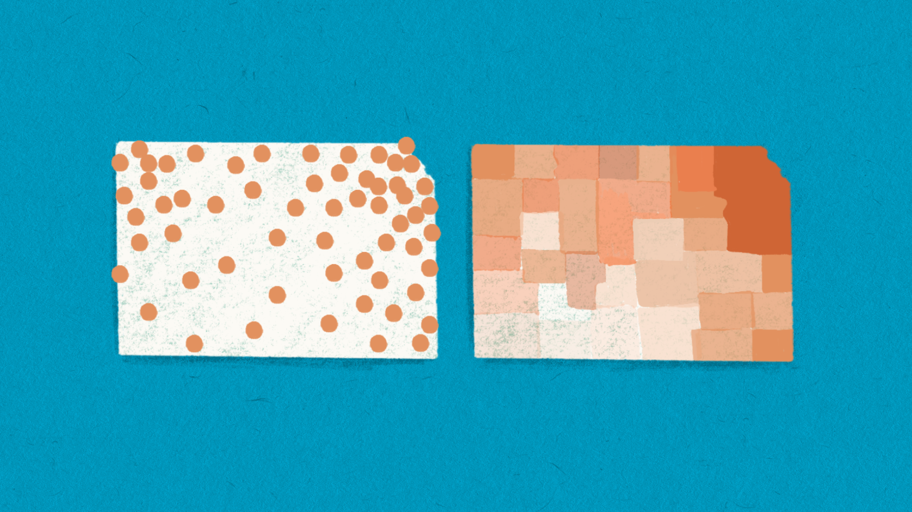
You plot points to show people exactly where something is and shade areas to show varying degrees of concentration across a region. The darker the shade, the more concentrated the units in the geography.
To plot points, you want to use addresses or geocoordinates.
If you want to shade areas, you would be better off using counties or states.
Some tools that could help
- Google MyMaps is free for Google Workspace and is great for dropping a couple of pins on a map.
- Geocodio can derive geocoordinates from a list of addresses with a great free tier.
- Zeemaps is a free mapping tool that allows you to import a spreadsheet to plot many points on a map. It also lets you create filled maps by different region types.
One last thought
If it’s not evident already, maps are about land, and land is political.
When you use maps to tell stories, don’t forget the political context they inherit.
For example, our Native American friends view the lines on the map very differently from the rest of the United States.

Until next time,
Ted
PS
If you are frustrated with your CRM and want to try something new, I’m providing a demo of one of my favorite CRM’s next Wednesday afternoon. You can register here.