


W.E.B. Du Bois presented an exhibit about Black American life at the 1900 Paris World Fair. His team of students from Atlanta University spent months meticulously creating 63 diagrams filled with charts and maps, hand-drawn and painted in vibrant gouache (a type of watercolor).
It was common in this period for World Fairs to present “savage” exhibits featuring people from places like Africa and Asia. (The Negro Village at the Paris World Expo in 1889, the Congolese Village at the Belgium World Fair in 1897, and the Phillipine Reservation at the St. Louis Fair in 1904 are all examples.)
These exhibits were broadly used to justify colonialism and, more specifically, bolster the popular theory of Social Darwinism–the belief that people existed on a spectrum of evolution, with white Europeans (and their descendants) being the most advanced race.
It was in this context that a Black, 32-year-old Harvard Ph.d. presented at the World Fair.
Du Bois was not content to merely challenge a narrative. He wanted to challenge the “thinking world” with evidence.
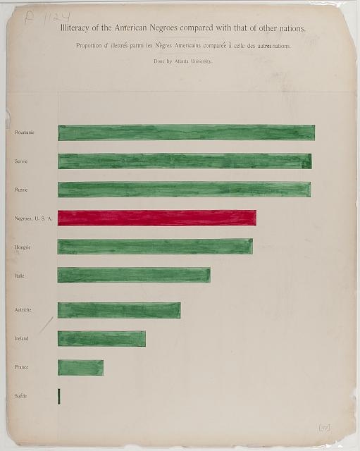
This bar chart illustrates that Black illiteracy rates (just a few decades removed from emancipation!) were comparable with those of many European countries.
Du Bois was among the earliest and most prolific sociologists to make their case using data. He focused his efforts in Georgia, where he could do more detailed reporting and build a robust picture of Black lives.
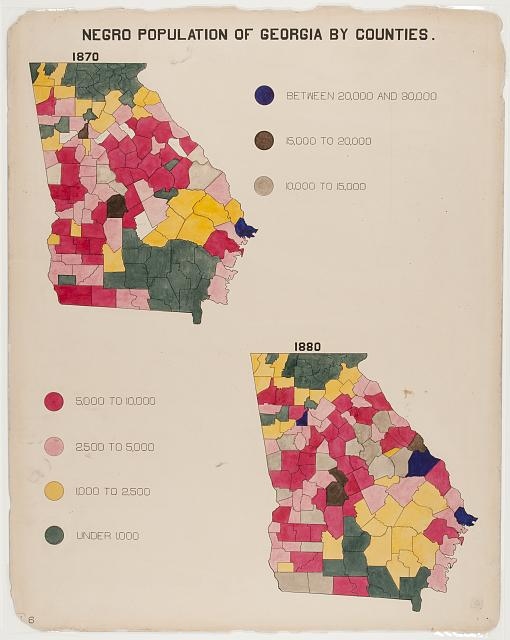
Maps of Georgia broken out by county
I’m stunned by the intricate illustrations and colors and can’t help but wonder about the unnamed team of students at Atlanta University painstakingly painting each county in Georgia with watercolors.
This is art as much as it is science.
Because of the local focus, he was able to illustrate the lives of households by their spending patterns. The percent-of-whole chart below shows that the percentage spent on rent (in black) is significant for the poorest and non-existent for the wealthiest Blacks (presumably because the wealthy owned their homes).
The percentage spent on “The Higher Life” such as religion, art, education, and books, is highest for the wealthy Blacks in Georgia, and notably still present among the poorest, directly subverting the belief that free Blacks would have no interest in self-betterment. Even the poorest pursue the “higher life.”
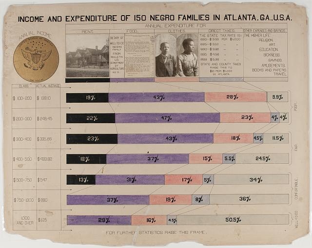
Spending habits of families broken out by income.
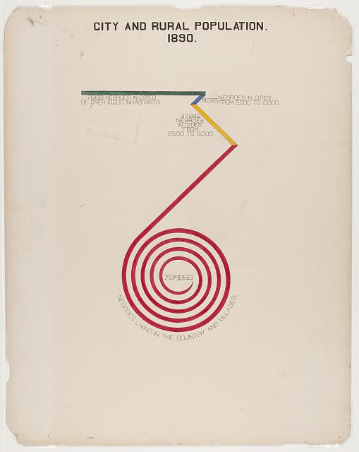
He experimented with chart types that defied category. The spiral below reflects the growth in household furniture value in Black homes from 1875 to 1900. It could be represented in a simple bar chart, but the creative illustration literally pulls the viewer into the data, forcing them to wrestle with its meaning.
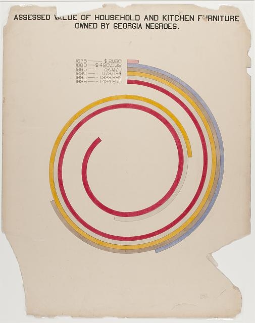
Spiral chart depicting the increase in spending on household furniture
Because everything was designed freehand, the team could create whatever visualization they imagined. A diagonal rectangle, a bar chart transformed into a spiral, or a cantilevered circle chart were all ways they invited people to wrestle with data.
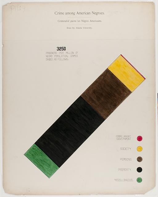
Diagonal rectangle chart
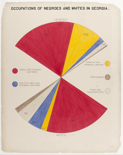
Circle chart with two balanced pieces of pie
Bar chart and line chart and spiral chart all in one.
As is so often the case, the medium is the message.
The first slide in the series reads:
“Prepared and executed by Negro students under the direction of Atlanta University.”
This marvel of analytics and design is not merely about Black people, but created by Black people.
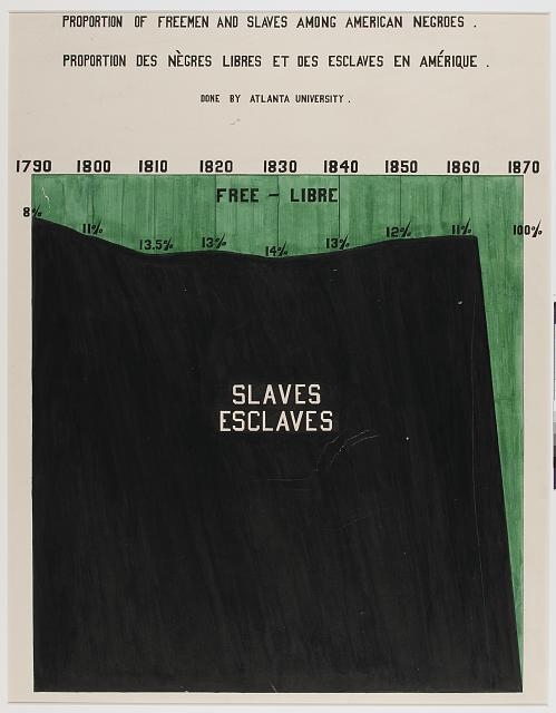
Line chart depicting the emancipation
Only one generation removed from slavery, Black students are transforming data visualization and design while paving the way for the field of sociology.
“The Exhibit of American Negroes” was awarded the gold medal by judges.
If you’d like to learn more about this exhibit, please read “W.E.B. Du Bois’s Data Portraits: Visualizing Black America.” All images were downloaded from the Library of Congress website.
Until next time,
Ted
P.S. Next week, I’ll be visiting my friends in Ghana, so you won’t receive an email. If you want to learn more about my work at the Yellow House, click here.